Ruffino
Aqua di Venus
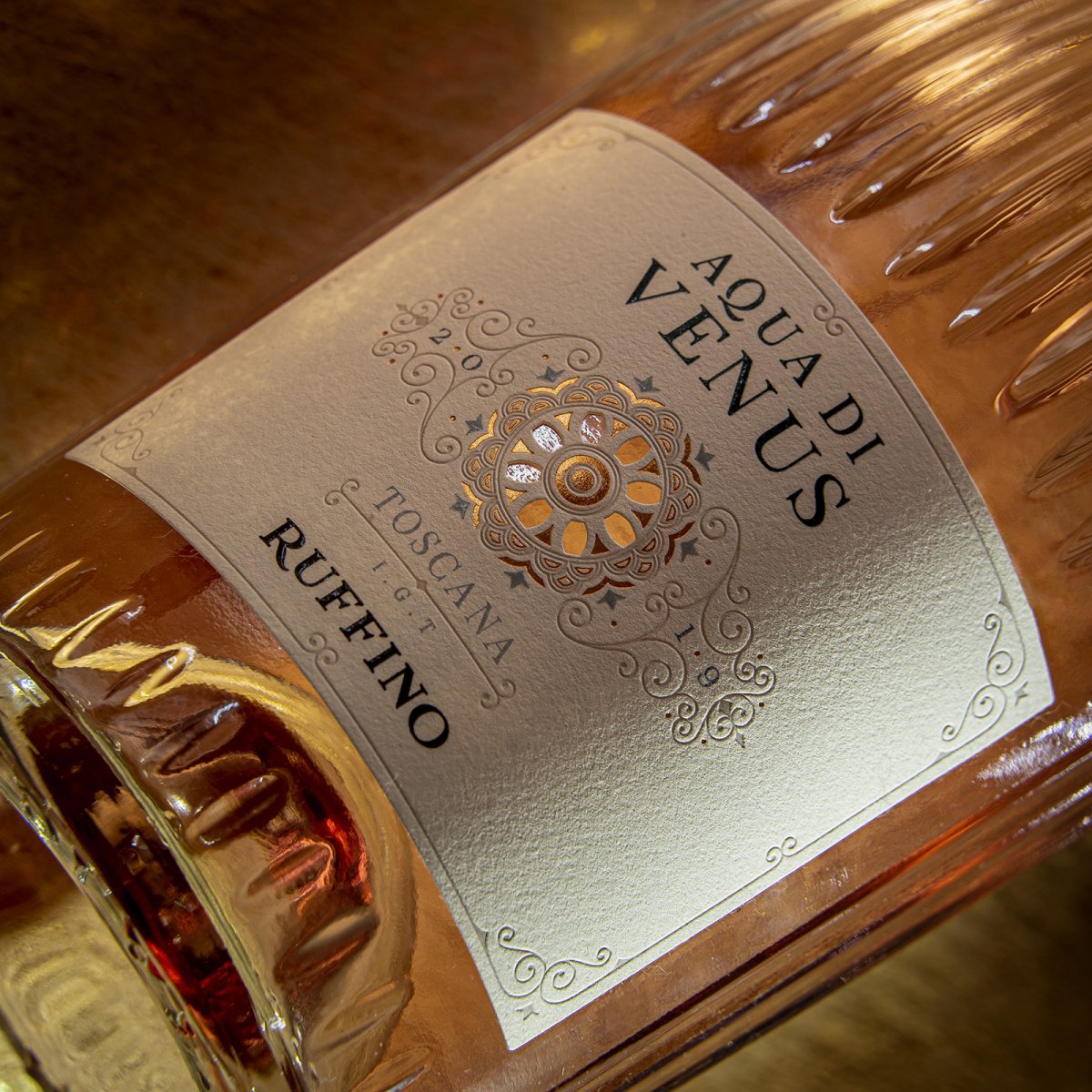
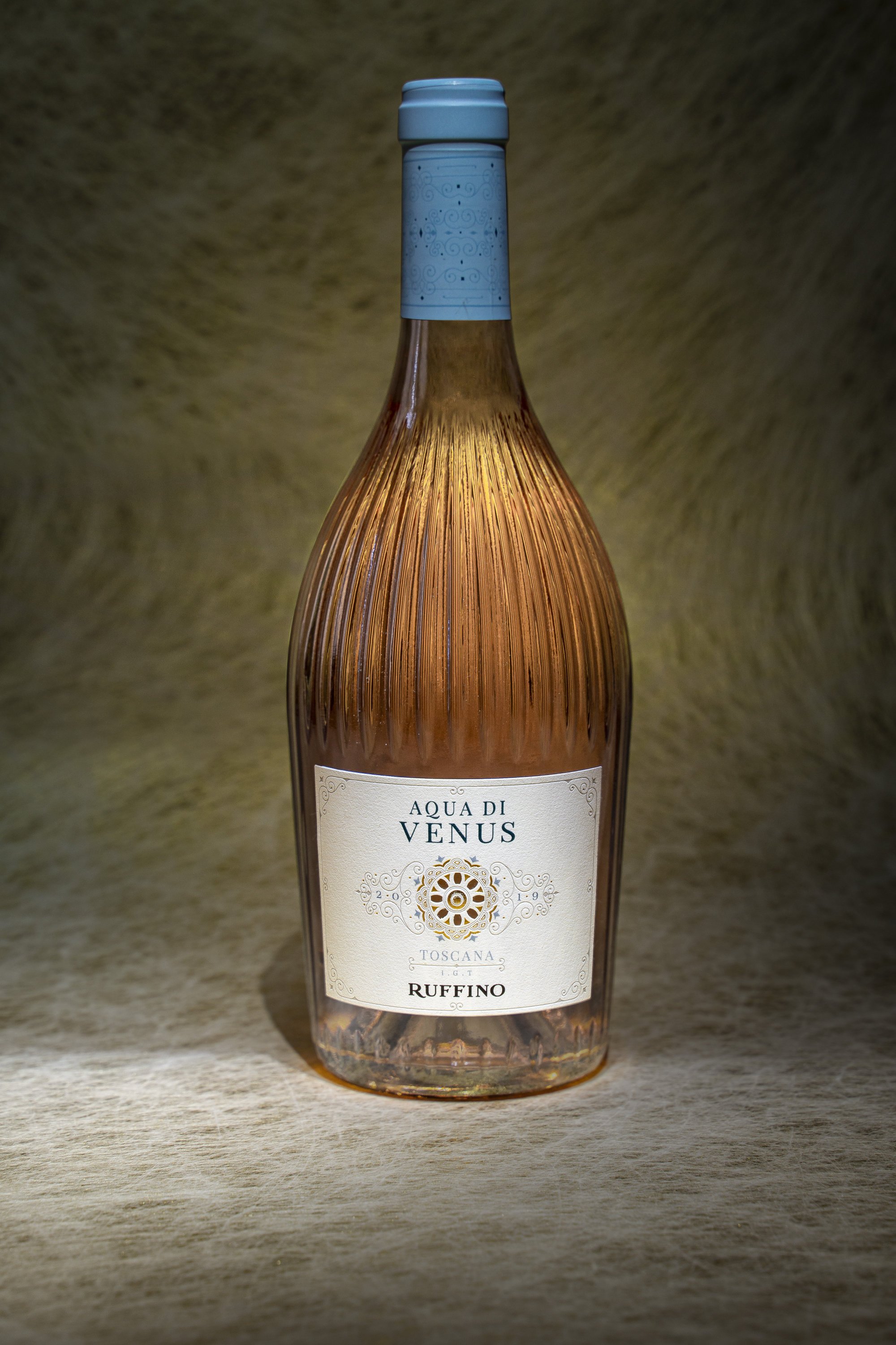
We lead the way into the soft foam of inspiration and allow the crystal-clear bottle to surface first, reminiscent of the perfectly sculpted half shell belonging to Venus.
Driven by the sea breeze, we turn the bottle over to note the name engraved on the base, just before the super smooth lip.
As the sea retreats the foaming waves and the sun turns pink at twilight, we allow ourselves to be cradled by the perfect charm of this tribute to Venus: Aqua di Venus.


The first word that comes to mind when thinking about Officina Grafica is teamwork. Every project creates this deep shared intention to succeed, respecting the deadlines and exceeding expectations. The second word is professionalism. Some projects have very clear requirements and ideas; they don’t require flights of fancy. It’s very rare to find a studio that can guarantee solid and constant quality over time. There are other projects, the best ones, when there’s room to be guided creatively and be surprised. In these types of projects, the third word that emerges is art. A group that teams up with the customer, that works professionally and contributes to our art of wine. That’s Officina Grafica for us.
Team Marketing
Ruffino
Label specs |
|
|
Paper |
UPM Raflatac Sabrage Ice Premium |
|
Print type |
Offset, hot foil, braille, debossing |
|
Printers |
Coverciano Grafica S.r.l. |
 |
Number of bottles≃ 200000 |